Tomato
A rebranding of the Tomato restaurant chain with more than 40 Italian-style pizzerias in the Russian regions. Restaurants are famous for their family atmosphere and delicious pizza.
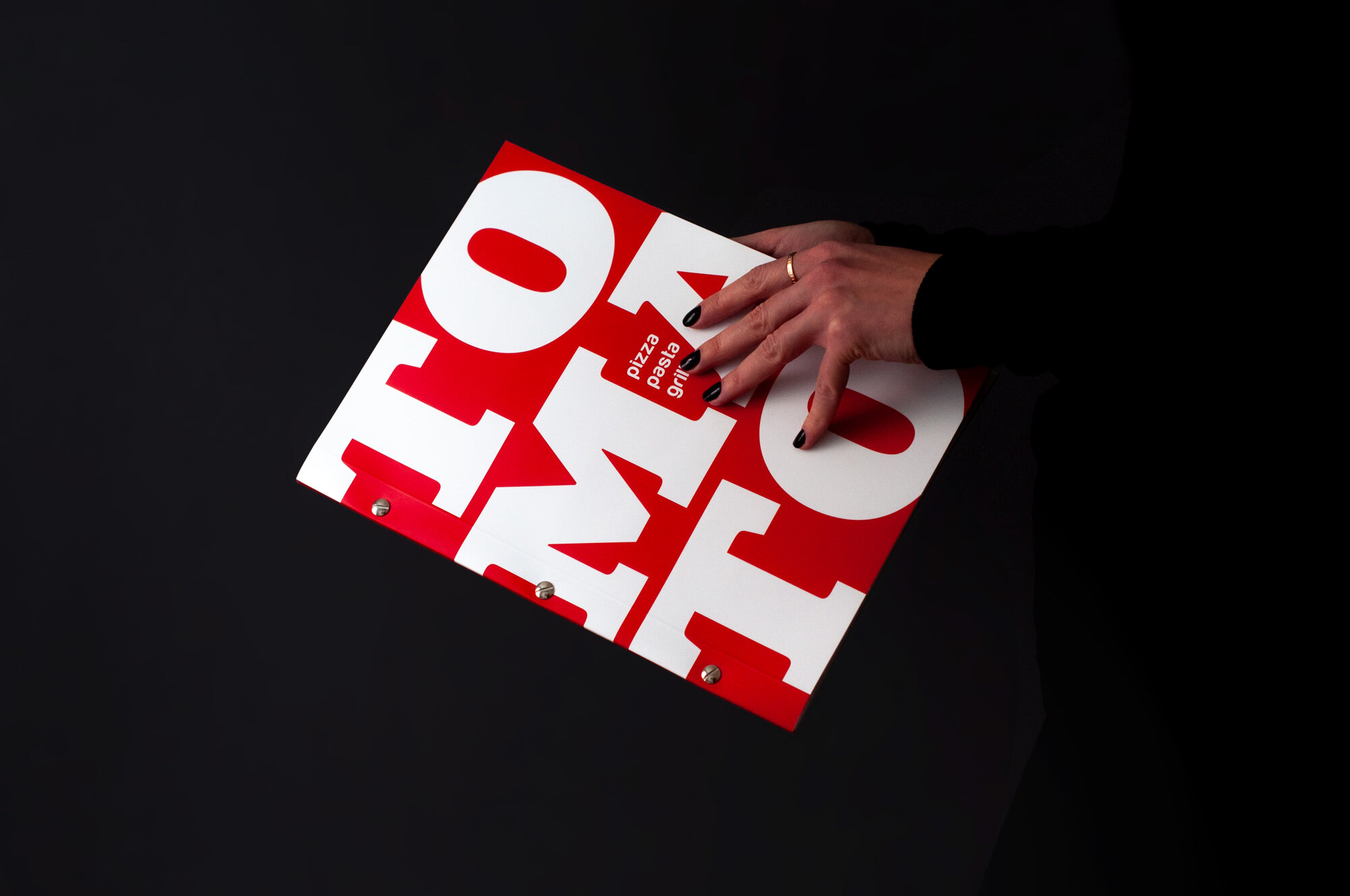
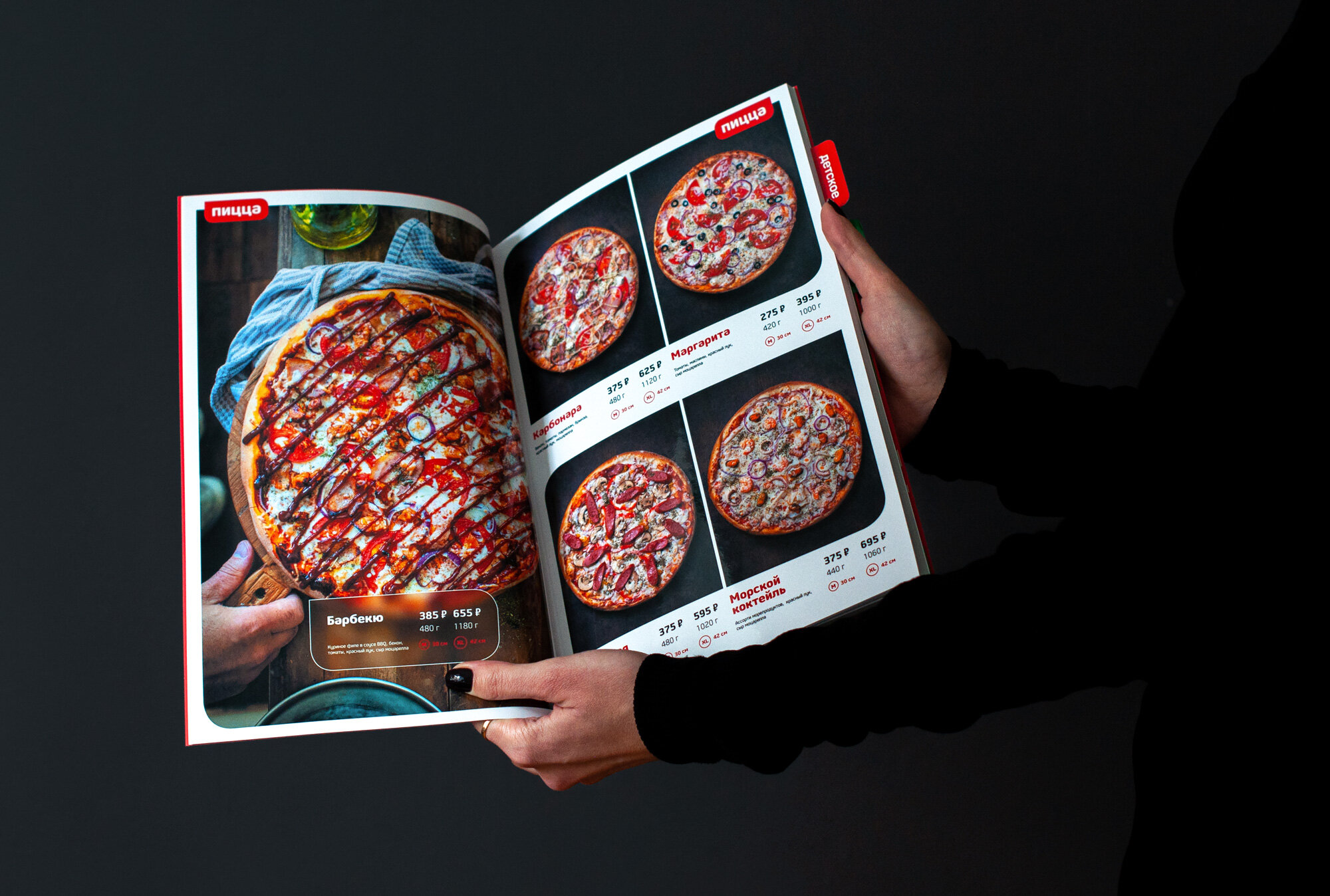
Rebranding, brand book, primary and seasonal menus, advertising, packaging, website design, and mobile app design were made for Tomato.

Tomato's new style is based on three core values: taste, family-friendly approach, and honesty.
We emphasized the guests' beloved values of Tomato, strengthened the brand and worked out the design to the smallest details.
The identity update and the new image-building of the Tomato restaurant chain have become an exciting challenge and a large-scale project for us.
The differences in regional consumer preferences, unusual insights, and the federal format of the restaurant chain greatly influenced the design of the project. We emphasized the guests' beloved values of Tomato, strengthened the brand, and greatly influenced the project design.


“Our ambitious aim is to create opportunities for future growth and development. Moreover, it is vital to establish the gap between rivals in time. For what? For the restaurant chain to generate focus on the products and structures quality. And to rely on a recognizable design thought-out down to the smallest detail.”
Nikita Gorbunov, Creative Director, GN10.
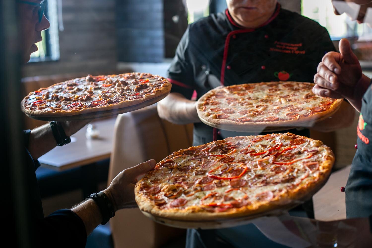
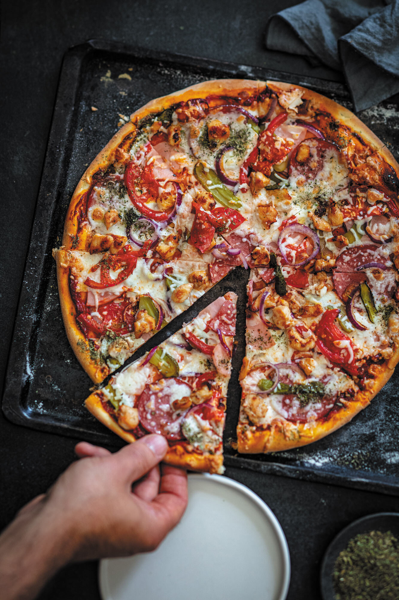
We took appetizing and honest photos of pizza and dishes together with food stylist Slava Pozdnyakov.


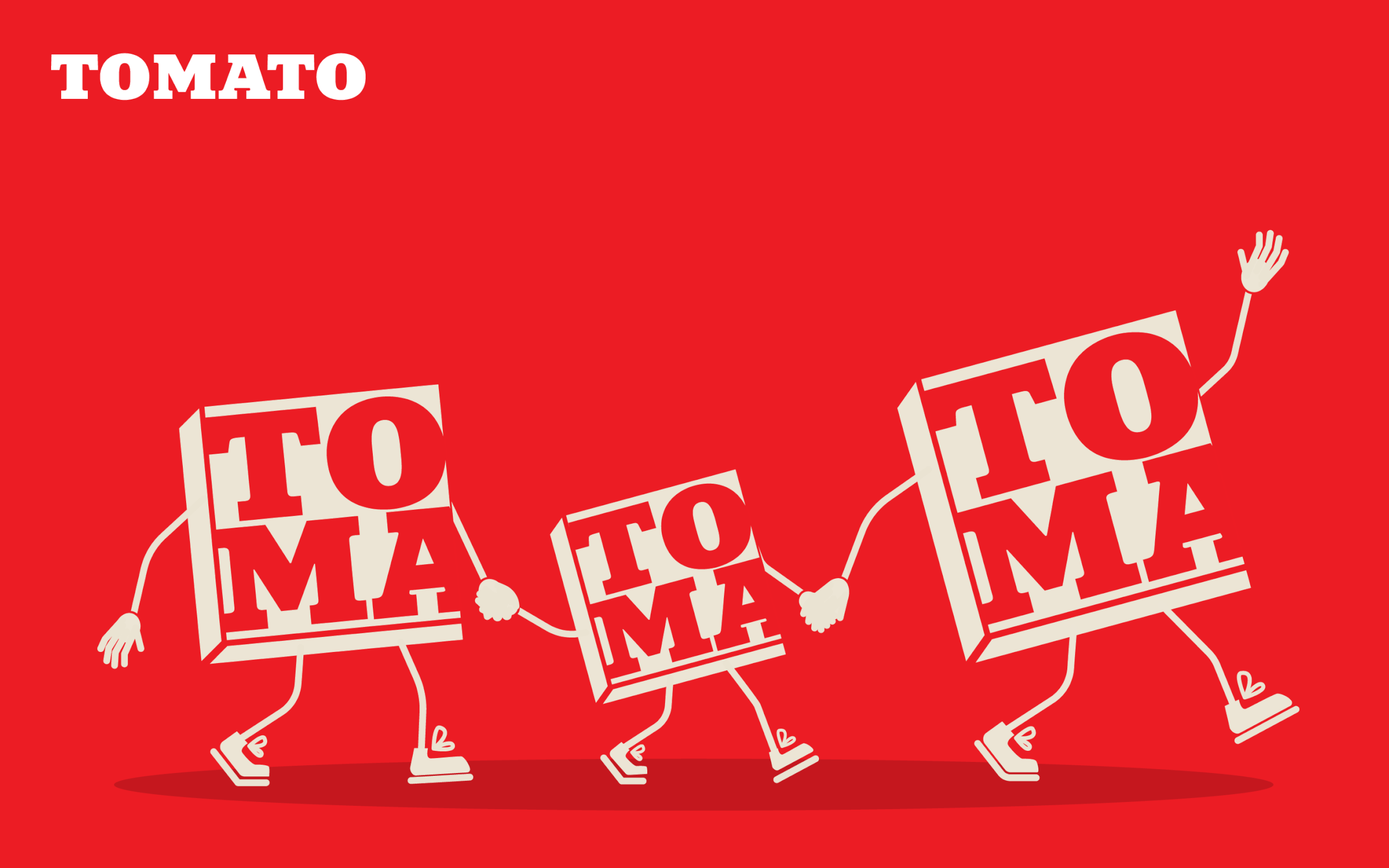
Due to the recognizable red color and the language of the "bubble," the restaurant chain began to communicate with guests straighter.

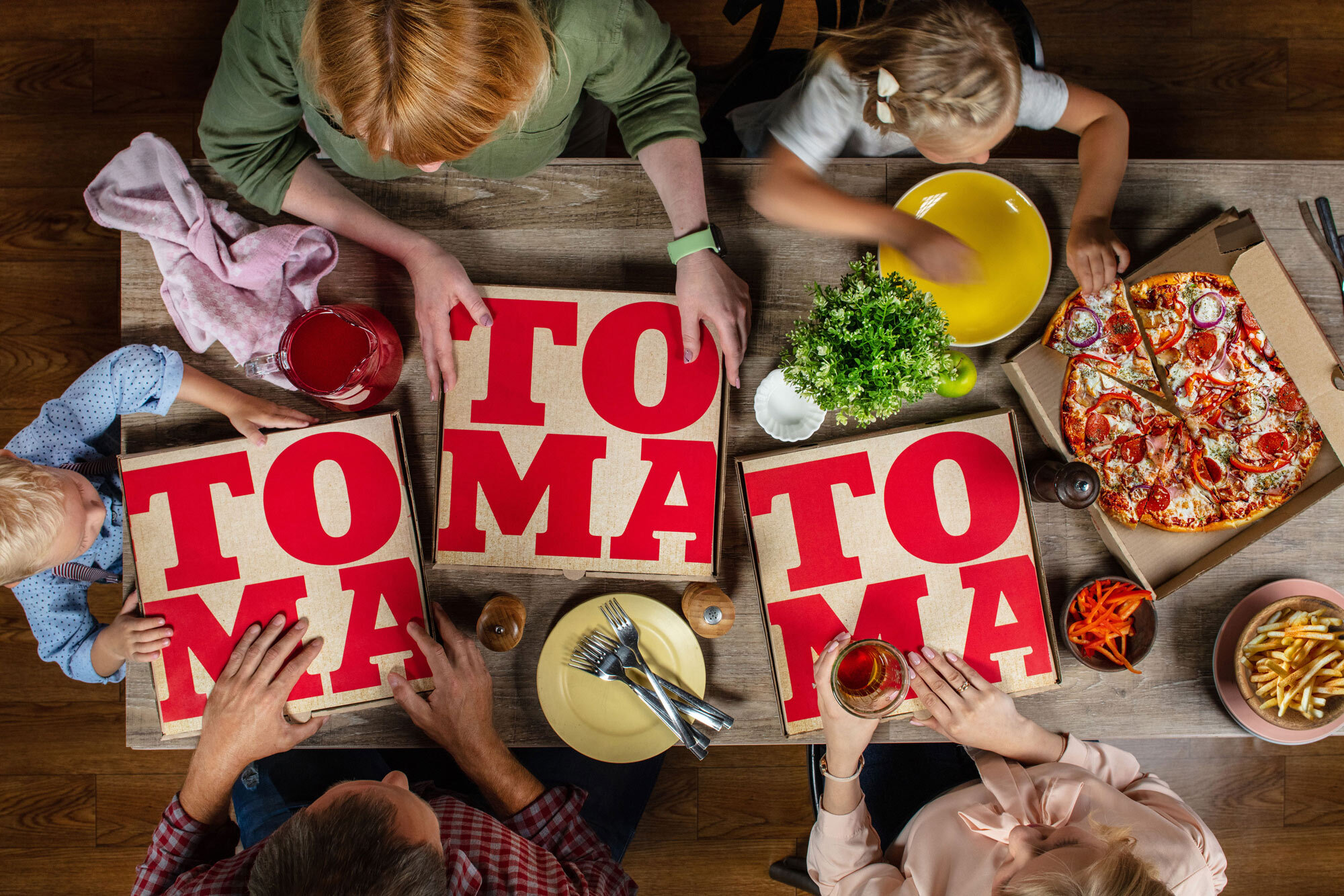
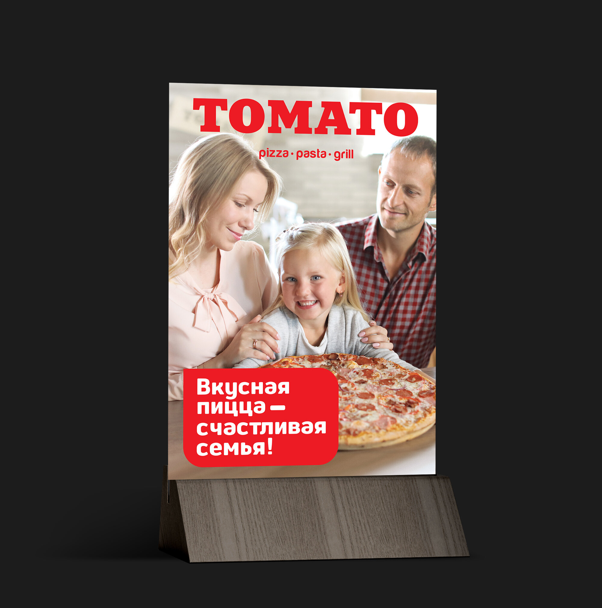
The main feature of Tomato is family values. A large free playground for kids greets guests in each restaurant. The restuarants are the place with an atmosphere where the whole family can relax. We made authentic and emotional family shots to highlight this unique advantage.


Shooting backstage