GN10 branding & design agency

Russian Railways Corporate University


Russian Railways Corporate University


Completely re-branding of Russian Railways Corporate University


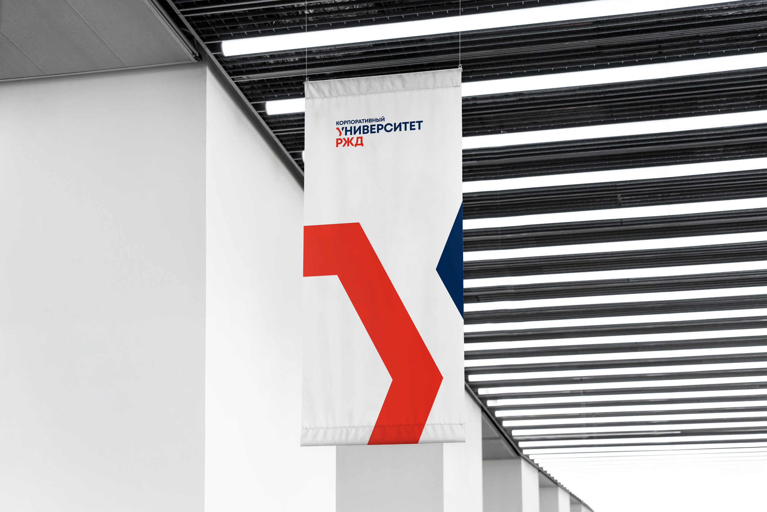
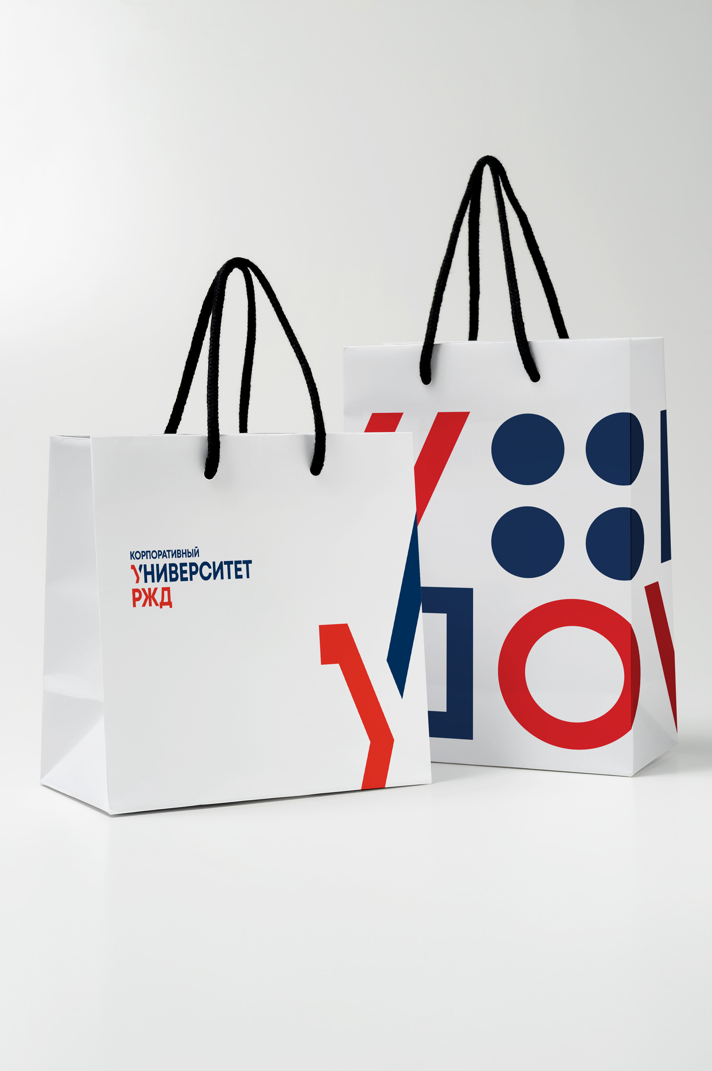
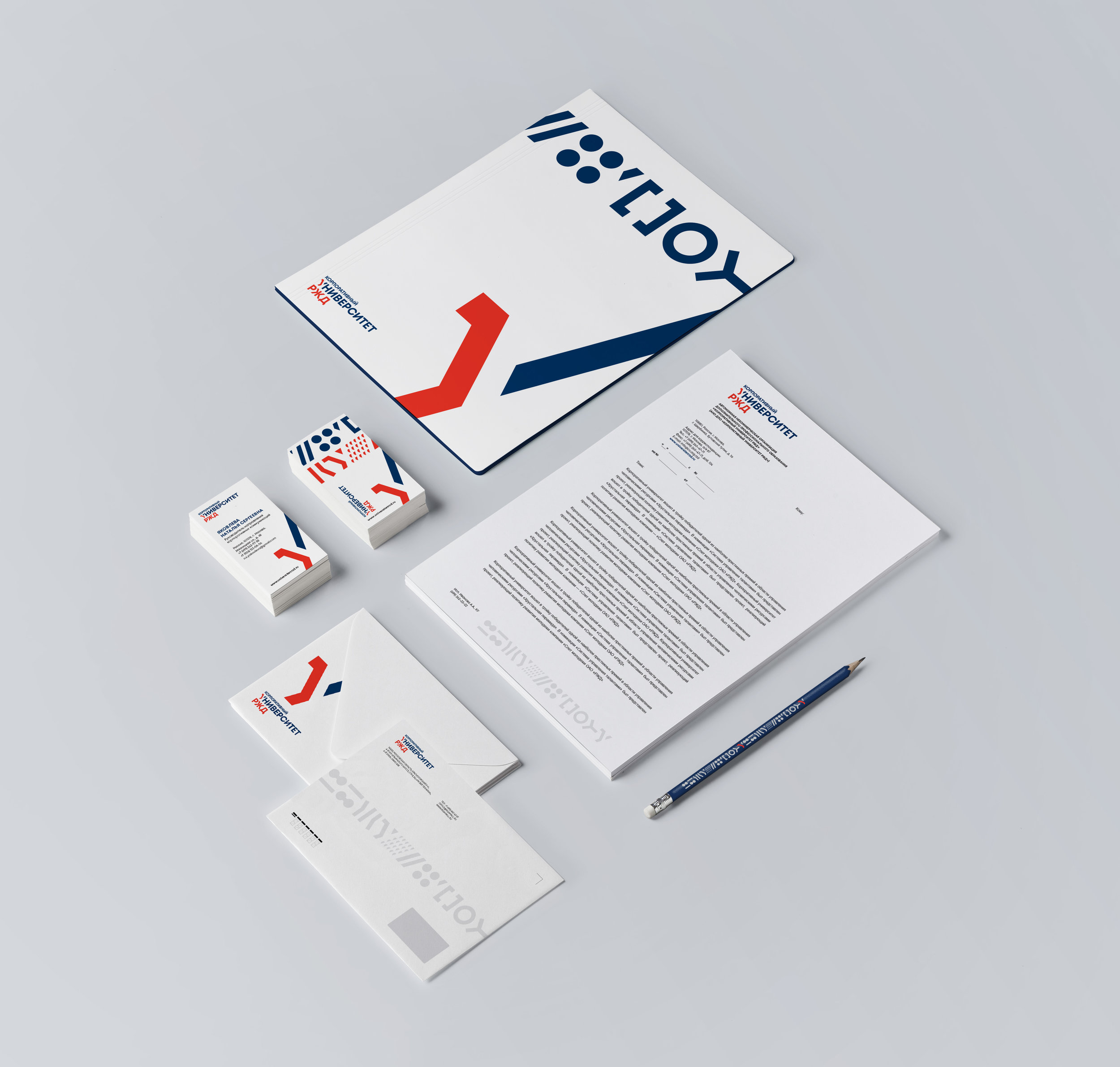
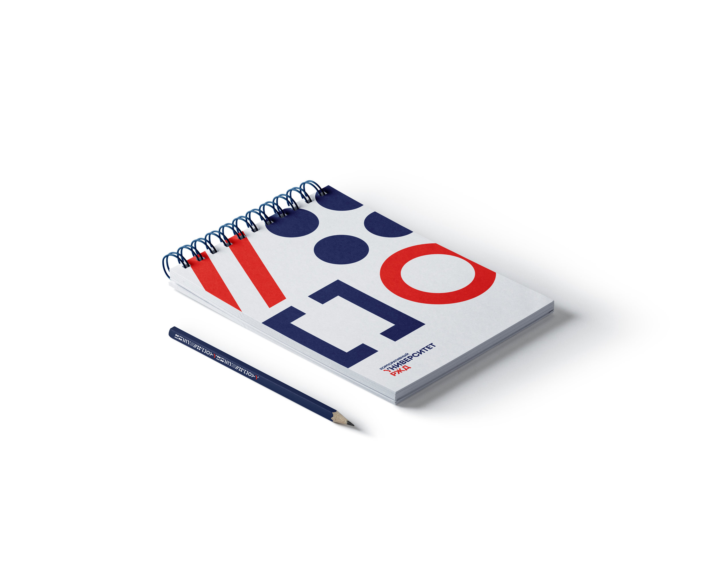
Brand platform, brand DNA, logo,brand identity, interior and campus facade design.

Y-logo.jpg


The font logo is based on the graphic interaction of letter “Y” elements, where the red element is reminiscent of a modern locomotive, and the dynamic upward straight line symbolizes continuous development and training. 


Russian Railways Corporate University is included in Russia’s TOP 3 largest business platforms. The University is tasked with creatively developing Russian Railways employees. 


pattern.jpg
 
Flag1.jpg
 

Corporate identity is based on the active use of the logo, with the stroke of letter “Y” symbolizing constant development.


paper_bags.jpg
 
branding-2.jpg


Corporate pattern is a recognizable visual language that conveys the idea of non-standard training. Different combinations of elements help create a wide variety of options. Signs refer to the railway and railroad transportation world.


diploma-horizont-2.jpg
 
brochure_inside2.jpg


brochure_2.jpg
Notebook-1.jpg
 
iphone.jpg